

How Hawker Signs Have Changed Throughout Singapore's History
- Advert & Signs Team
- Oct 29, 2025
- 9 min read


Key Takeaways
Hawker signs reflect Singapore’s own history, transitioning from hand-painted wood to LEDs, demonstrating how design adapts to materials, technology, and social transformation. See hawker signs as cultural artifacts, not merely menu boards.
The early hawker sign used basic materials and classic calligraphy to denote genuineness and reliability. Save those signals when modernizing a heritage brand.
Modernization introduced bright colors, printing, and more aggressive branding to jam-packed bazaars. Apply obvious hierarchy, vibrant but harmonious palettes, and readable fonts for immediate identification from afar.
It’s all language choices and what curtails or expands the audience. Put multilingual messaging and obvious transliteration first to greet diverse diners.
Design ignites appetite and mood, therefore align color, typography, and materials to cuisine and environment. Test visibility at five to ten meters, and select materials that are rugged and require minimal upkeep, whether indoor or outdoor.
Mix nostalgia with modernity by maintaining iconic logos or symbols while incorporating QR codes, social handles, and dynamic digital components. Refresh with care to safeguard your identity and increase sales.

Signage Generations
Hawker signs in Singapore trace generations of craft, policy, and taste, illustrating how food culture and public life evolve.
1. The Pioneer Era
In the beginning, hawker signs were hand-painted on wood or tin using inexpensive enamel and sure hands. Paint bled in rain and boards warped in heat, but the words remained readable through a speedy scan.
Makers used what they had: recycled planks, stencils from cardboard, and brushes trimmed by hand. Fonts were unassuming and strokes bold, fashioned for velocity and legibility instead of flair.
Scripts trailed the streets with Hokkien and Cantonese names, Chinese characters with good luck sayings, Tamil and Malay, and sometimes Arabic benedictions. Language seemed native and intimate.
These signs vowed integrity. A last name, a meal, a prayer could be a cost and a torn newspaper snippet stapled adjacent. Trust sprouted from simple truths and a steady dish.
2. The Transitional Period
Plastic sheets, aluminum panels and screen printing came into stalls, accompanied by lightboxes and large format printing. Brightened colors, bold sans-serifs and thick outlines made names pop from a distance.
Economic growth pushed polish. Neat edges, consistent sizes and weather-resistant films slash upkeep. English became more prevalent on signs as language laws changed and border lines between dialects became smaller.
The 2020 Census indicated that dialect use at home dipped from 14.3 percent in 2010 to 8.7 percent in 2020, and the signs reflect that. Hawkers jumbled old and new, gold brushstrokes for fortune beside a neon red headline.
A few extra clippings and ‘featured in’ badges justify value. Others went with 3D box-up letters for depth and quick reads in crowded corridors.
3. The Digital Age
LED strips, backlit acrylic and slim digital displays lift visibility in jam-packed rows. Branding matters: a crisp mark, a color code and a tagline people remember.
QR codes connect to menus, wallets, and reviews. Social handles hover near dish names. A lot of stands change out signs every year, around 80% swapped out every year, to keep things fresh, try promos, or update awards.
Technology makes revisions quick. Rates change, deals spin, tongues flip for the audience. Preferences split by generation: some pick sleek monochrome, others keep blessings and script flourishes.
The effect is a chorus—Hokkien nicknames, Tamil characters, Arabic praises—trading space with LEDs.
Beyond The Menu
Hawker signs tell more than just entrees and costs. They suggest flavor, tempo and atmosphere, sculpting our anticipation pre-ordering. A red bold board could indicate spice and heat, a clean sans-serif layout hints at lighter fare or modern twists.
Design can tug us backward to remembrance or forward toward discovery. Part of setting a meal in Singapore is reading signage beyond the menu. Hawker food is life here and the meal feels fuller.
Cultural Identity
Hawker centres reflect Singapore’s multicultural mix, so signs frequently combine Malay floral borders, Chinese brush calligraphy strokes, and Tamil curve forms with vibrant Peranakan tiles. These aren’t decorative motifs; they’re cues of heritage and technique.
A wok silhouette nudges Cantonese stir‑fry. Banana leaf artwork winks to South Indian feasts. Ketupat motifs murmur of Malay festal cuisine. Color matters too: gold and red for prosperity on roast‑meat stalls, deep green for nasi padang, seaside blues for Teochew seafood.
Language changes this read. A Chinese name next to Hainanese symbols guides us to chicken rice, while Jawi script with satay sticks roots Malay traditions. Signs emblazoned with “since 1968” or a founder’s portrait tend to ignite pride, with countless customers digesting history as a sign of artisan-ness.
Nutritional claims now pepper the menu, echoing a health-conscious city. The sign moves just 29% of initial picks and it sets the stage for almost everyone who walks by.
Linguistic Markers
English for wide distribution, dialects for profundity, Malay, Mandarin, and Tamil for community roots.
Language selection reaches groups by comfort and trust, attracting families, seniors, or visitors to things they can decode quickly.
Pinyin surged following the 1979 Speak Mandarin Campaign, which converted countless boards from dialect representations to standard. Transliteration and local slang, such as “wok hei,” “gao,” and “shiok,” indicate subtlety.
Multilingual signs broaden reach in centres that reflect national diversity, and dialects amplify authenticity for 42% of interviewees.
Family Legacy
Some families bequeath sign layouts like heirlooms with the same baseline grid, color block, and founder’s name. Original logos persist even as 80% of hawker signage is replaced annually, which makes survivors anchors.
Some get minor facelifts with LED backlights, sharper fonts, and allergy icons without sacrificing the old crest or date stamp, which others take as testament to the artisanry.
Legacy signs help customers find “their” stand quickly, recall flavor notes, and remain loyal for generations.

The Art of Attraction of a Hawker Sign in Singapore
A hawker sign is the first handshake. It grabs eyeballs from 30 meters, establishes mood and frames flavor anticipation. First impressions orient sales, and even though just 29 percent report that design influences their purchases, that segment can turn daily volume, particularly in bustling centers where selection is broad and minutes are fleeting.
A killer sign cohabitates with scent and food presentation and lane-level buzz. It whispers narrative—ancestry vintages, recipe prompts, cost transparency—and fuels the talk that finalizes the experience.
Checklist for effective features:
Visibility includes bold contrast, clean edges, high-lumen lighting, and readability at 25 to 40 meters.
Relevance: Cuisine icon or dish photo; display condiments, seasonings, or herbs.
Credibility: years in trade badge, awards, source point for confidence.
Clarity: short menu hook, prices in clear numerals, opening hours.
Harmony: Colors, type, and materials that fit the food and the crowd.
Sensory echo: visuals that match aroma and plating. Think banana-leaf greens nodding to Nyonya dumplings.
Colour Psychology
Color stimulates appetite and mood. Warm colors seem immediate and fast. Cool colors relax and decelerate. For snack crowds who skim quick, this counts.
Let red, yellow, or orange indicate to you heat, speed, and hunger. Red translates as accomplishment in a lot of cultures, so it can enhance attraction.
Stay away from scummy blue or dull gray near food. They deaden warmth and can cool a hungry stomach.
Stick with on-brand colors and cuisine-related hues. Hot grill? Hot palette. New mom dumplings wrapped in green leaves? Match earthy greens with warm neutrals to channel that vibe.
Material Matters
Wood, acrylic, metal, and digital all impact maintenance, weight, and appearance. Outside stalls battle sun, dust, and rain. Inside ones combat glare and cramped quarters. Match material to budget and site, not trend.
Tips:
Rain-prone curb: powder-coated metal with sealed edges.
Night trade: backlit acrylic or LED modules.
Heritage vibe: oiled hardwood with raised letters.
Promo-heavy menus: small digital panel for specials.
Pros and cons:
Typographic Tales
They scan, they dash about. Big x-height, strong stroke contrast and simple forms trounced ornate curls from 20 to 40 m.
Font to match stall soul and food. A neat sans for fusion bowls, a rugged serif for long-run family rice stall. Fancy scripts impede reading and obscure prices.
Use size and weight to guide the eye: largest for stall name, medium for hero dish, smaller for add-ons. Keep letter spacing loose and try from across the alley with actual steam and audience din.

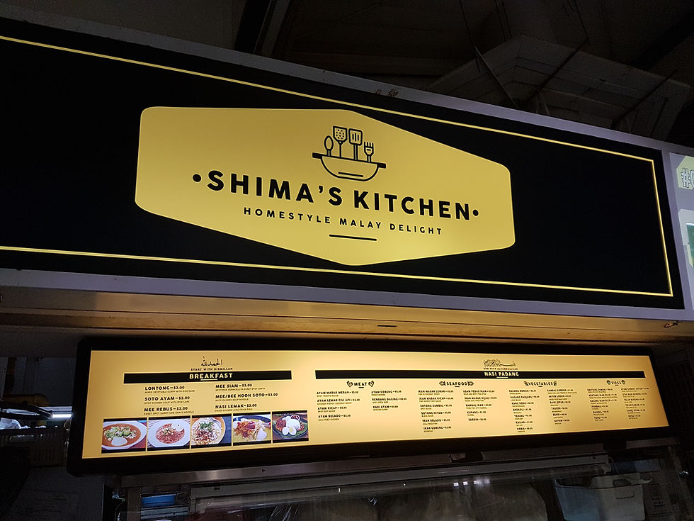
Modern Hawker Branding
Modern hawker signs have the job of being a menu, a handshake, and a memory cue. They need to appeal to both locals and visitors, have impact over the din of a bustling hawker centre, and withstand grease, steam, and time.
Powerful brands begin with purpose! If you’re a hawker stall specializing in one hero dish, your sign needs to bring that hero dish front and center with a clean name, a readable logo, and colors people can see from 20 meters away. With language changing, many stalls now brand themselves in English for clarity.
In Singapore, dialect use at home decreased from 14.3 percent in 2010 to 8.7 percent in 2020. A few stalls maintain bilingual lines as a nod to their roots and assist elder customers. That combination says honor and casual.
Design specifics do matter. Neon colors, brushed steel, and touches of charcoal black can reflect the atmosphere of the food hall. Pictures punch a potent first blow for occasional visitors, so clean shots, clean graphics and neat price presentation assist people to pick quick.
History pulls weight: 57% of people in one study link historic cues to 'authentic.' A founding year, a family name or old script can add trust without feeling contrived.
Churn is real. Heat and grime cause 80% of signs to require swapping annually. Prepare for this cycle with files in hand, modular panels, and a budget line. Leverage the refresh to coordinate colors, refresh the logo, and de-clutter.
Keep the palette tight with two core colors and one accent, and carry it through menus, aprons, and delivery stickers. A lot of hawkers even include their social handles on the board. An Instagram tag allows followers to upload and share rush-hour pictures, extending buzz outside the line.
Steps to keep the brand tight:
Define the promise and top dish
Sketch a simple logo
Choose two core colors, one accent
Set type for price and dish names
Add English, keep key heritage lines as needed
Use pro graphic design for files and print specs
Plan annual refresh with budget and timeline
Add Instagram handle and photo spot marker

Conclusion
Hawker signs do actual work. They direct the eye, create an atmosphere, and whisper flavor before the initial chomp. Faded paint and neon exude cojones and pride. Fresh LEDs and clean fonts display velocity and credibility. Both create draw on a bustling avenue.
To know quickly, observe the queue. Head count by the hour! Test color shifts over a week. Trade a word on a board and record sales. These simple tweaks are worth it!
Make it with love. Give the makers credit. Infuse the spirit of the stall in every stroke and spark. A bowl of noodles somehow tastes warmer beneath a hawker sign design that feels human.
Ready to customize your own hawker sign! Put out a share, or request a quote from Top Signage Maker Singapore today.

Frequently Asked Questions
What is a hawker sign?
A hawker sign is the brand of a street stall. It showcases the stall name, menu highlights, prices, and branding. It directs customers, establishes credibility, and differentiates stalls in crowded markets.
How have hawker signs changed over time?
From hand-painted boards to printed panels to LED displays and menus, modern signs mix the glory of tradition with clean fonts, transparent prices, and brand colors, all for more visibility and trust.
Why does signage matter beyond the menu?
Good signage says good, clean, and cheap at one look. It cuts down on confusion, quickens orders, and boosts sales. Good signs tell a brand story, not just dishes.
What makes a hawker sign attractive?
Sharp contrast, readable fonts, clean layouts, powerful lighting and mouth-watering photos. Uniform colors and short copy enhance recognition and recall even from afar.
How can modern branding help hawker stalls?
Branding means everything matches – the signs, the uniforms, the packaging, even the web and yellow pages listings. It creates loyalty, enhances discoverability and sustains premium perceived value while maintaining the genuine vibe.
Who creates hawker signs?
Designers, sign makers, calligraphers, and printers. Some stalls collaborate with branding studios, and others with local craftsmen. Working together guarantees precision, robustness, and resonance.
What’s next for hawker signage?
Think digital boards, QR menus, dynamic pricing, energy-efficient lighting. Data-driven layouts and accessibility features, such as icons and larger type, will increase clarity and customer flow.
We, at Advert & Signs, know that an acrylic signage is important for your branding; Whether you opt for acrylic, metal or custom lightbox signage varieties, there are endless ways to make your brand pop with a professional finish that’s modern and chic.


Comments